Thursday, 20 December 2012

Gravity-Defying Land Art by Cornelia Konrads


"German artist Cornelia Konrads creates mind-bending site-specific installations in public spaces, sculpture parks and private gardens around the world. Her work is frequently punctuated by the illusion of weightlessness, where stacked objects like logs, fences, and doorways appear to be suspended in mid-air, reinforcing their temporary nature as if the installation is beginning to dissolve before your very eyes." (http://www.thisiscolossal.com/tags/installation/page/6/)

Gates made by organic objects.

A Wall of Shattered Glass Floods a Benedictine Monastery


"Aerial is a new site-specific installation by Baptiste Debombourg (previously) at an old Benedictine monastery called Brauweiler Abbey near Cologne, Germany. Debombourg used numerous sheets of shattered laminate glass to mimic a frothy flood of water rushing into a room. Remarkably beautiful work." (http://www.thisiscolossal.com/tags/installation/page/6/)


This installation looks so beautiful.
Only if it is made by real ice not by the glass, in freezing environment....

Sunday, 2 December 2012

Leaves, stones

Continues from the previous post, possibilities of using organic materials in graphic design.


My past project of leaving a message in a public place.
I used little stones I found around the place.


Leaf typography by Shiori Uchimura


Saturday, 1 December 2012

Insect Typography


After I had the lecture of sustainable design with scientific technology, I came up with the idea of using organic material for graphic design. It could be live creatures as well.


Insect typography by Stefania Marconi


Caterpillar letters by Nina Katchadorian


For the last video, although it's failed I like how the letters naturally fade out because the 'letters' are all alive. Thought I could use bees or ants instead.  Like if I put some honey in letter shape in natural environment, either bees or ants come to eat honey and at the same time they make letter shapes by themselves for a little while. Then when they finish eating the honey they all disappear. This idea could be used to leave a message in a natural environment for a short time super eco-friendly.

Friday, 23 November 2012

Reduce wastes and chemical impacts


http://www.tedresearch.net/3-reduce-chemical-impacts/
http://www.kategoldsworthy.co.uk


Today I had a lecture by Kate about design to reduce wastes and chemical impacts.
I like her idea of recycling old carpets to create new pretty carpets by cutting its surface by laser cutter and make beautiful patterns on it and also dying it with natural materials. Because she's recycling old carpets, her finished products seem like it already got vintage quality and it's adding value to itself.
It is quite a simple idea but could be a starting point for everything could be recycled.


I know it's all by his hand but laser cutting reminds me of works of Rob Ryan.

http://tagfinearts.blogspot.co.uk/2012/06/rob-ryan-solo-exhibition-and-calendar.html

Imagine if he uses old prints for his material, it could be anything like old posters, newspaper, ads... He surely creates amazing value to the wastes.

Friday, 9 November 2012

Paper houses by Shigeru Ban


This Paper Partition System one of his disaster relief project created for Japanese people after the tsunami happened 2011. As a Japanese, the disaster was the terror which I can never forget. When the victims had to live in a gymnasium all together, how to keep their privacies protected was a big problem. This partition system is so simple but really clever to separate their private spaces apart with low cost and no difficulties. Also it is reusable when it is in needs and could thrown away easily.

While most of the Japanese people felt impatient with their uselessness in helping those victims, I adore how Ban supported them immediately with his clever design. I yearn to be a designer like him who could contribute toward overcoming any difficulties for the people.

http://www.shigerubanarchitects.com

TED's TEN

1. Design to minimise waste
2. Design for recycling/upcycling
3. Design to reduce chemical impact
4. Design to reduce energy and water use
5. Design that explore clean/better technology
6. Design that looks at models from nature & history
7. Design for ethical production
8. Design to replace the need to consume
9. Design to dematerialise and develop systems and service
10. Design activism

http://www.tedresearch.net

I list TED's TEN here for not to forget it.
These ideas could all used for how today's graphic design should be like. Especially graphic design that we could see in daily life is advertisement printed on paper which consumes a lot of material. I think all graphic designers should consider how those ads could be sustainable since most of them are dumped after they finished their job. Graphic design could also seen on TV commercials which has a huge influence to the audience. It could be a good chance to tell how sustainable design is important to many people. At the same time when we solve design brief, I'd like to think how I could combine the idea of sustainability together.

Wednesday, 31 October 2012

Uniqlo's recycling policy


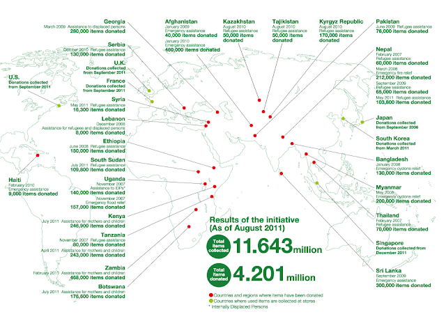
When I was researching about Uniqlo for the previous post, I found that Uniqlo is constantly doing recycling of their own clothes by donating them to many countries where people need more clothes which I think is truly amazing. Not just as a material but they are extending their clothes' lives as clothes, it could be done because their products have the quality to last as good things to wear.
I think their innovation in fabric brought them ultimate sustainability and allow them to take a responsibility as a mass fashion production.
http://vimeo.com/29081709

http://www.uniqlo.com/en/csr/recycle/

Tuesday, 30 October 2012

Uniqlo Heatech Campaign


   I joined an unique campaign of Uniqlo to get free Heatech. Through a mobile game, just rubbing my mobile screen, it said I converted some energy by my kinetic energy. I'm not sure how my energy works but I saw so many people joined this campaign to redeem free Heatech.
   I'm a big fan of Heatech so I literally wear it every single day through all autumn and winter. It is made of fine thin fabric and it does keep warmth dramatically. I think it was really good campaign to spread amazing function of Heatech and let people wear it more so they use less heater and save more energy. Innovation of the fabric and unique style of campaign worked very effectively in this case.


http://www.uniqlo.com/uk/corp/pressrelease/2012/10/uniqlo_unveils_plans_to_warm_u.html

Friday, 26 October 2012

Workshop


Today we had a workshop thinking about alternatives of what we'd created before.
Graphic design group(me and Olivia) talked about Wooden Dingbats which is a sign made of MDF board.

I thought I understood the idea of sustainability but actually it was really hard to think about how this wooden sign could be sustainable. We focused on the material itself and found an alternative called ECO board (http://www.eco-boards.eu/) which is strong as MDF but made from waste of agricultural products. I don't think this makes the wooden sign itself sustainable but at least if we use the recycled material it could reduce the number of trees being cut down.
It was interesting to think about the process how this material is made and came from where and also think about eco-friendly alternatives.